Plotting Fitted Counterfactuals in DiD models
Introduction
You estimated your Difference-in-Difference (DiD) model, or some variation thereof, and are ecstatic by the results. Are they valid though? Did you validate your parallel assumptions or do sensitivity analysis? What if visually it is difficult to discern whether your parallel assumptions hold while your statistical tests return mixed or ambiguous results? Well, fear not, my hardy econometrician (or statistician)! You can plot the fitted counterfactual against both the observed and fitted results to see whether the estimated counterfactual makes any sense and, if it doesn’t, why. Conceptually, the exercise is incredibly simple since the treatment effect parameter just shifts the counter-factual line away from the treated line.
In this notebook, I simply aim to show how one would go about plotting the estimated counterfactuals and go over a real-world example where such an analysis would be useful. It is more or less implicitly assumed that you are quite familiar with DiDs and their nuances. Nonetheless, this rather length post should also provide a good refresher into DiDs.
However, this notebook isn’t only about DiDs:
-
Have you ever tried generating data for a DiD model? It’s cumbersome and I show you how to do it here
-
How good are you with plotting? Subplots and loops over them are here
-
Perhaps most importantly, there is a useful exercise in exploring the
statsmodelsmodule in here - including how to extract fitted parameters and do useful stuff with them -
A disussion on how you want to tailor your DiD model and how to interpret the visual results of your fitted counterfactual is here
Motivation and Example
In some of my recent work on residential mobility, I have been attempting to estimate a DiD model but my results have been mixed and quite sensitive to both specification and data subset. As a result, I decided to investigate the underlying issues which led me to plot some of the fitted counterfactual plots. Admitedly, these plots are a bit of a mess and ones below are much better illustrations #practice. Anyway, what about the lines below?
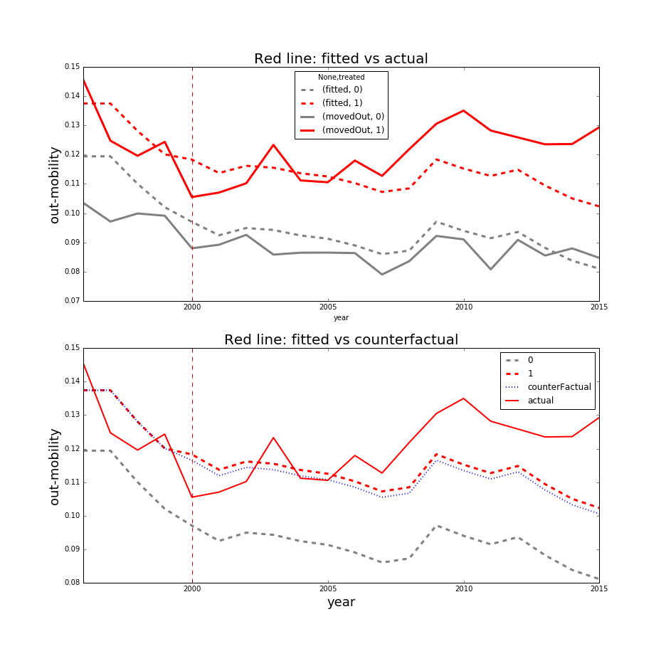
In the first plot, we see the observed and fitted trend lines for the treated (red) and the control (gray) groups. It is immediately apparent that the fitted line for the treated group does not quite capture the observed average trend, especially after 2005. However, the first plot is mostly provided to show the average observed trends.
In the 2nd plot, we see 4 lines. The solid red line is the observed average trend for the treated, the dashed red line is the fitted trend for the treated group, the blue dashed line is the estimated counterfactual for the treated group, and the dashed gray line is the fitted trend for the control group. Whew, that was a mouthful. One thing that is obvious is that the red line’s trend for the treated group began an upward trend after the treatment year in year 2000 while the trend for the control group is either plateauing or decreasing. The fitted trend for the treated fails to capture that uptick and the fitted counter factual closely follows the fitted trend so the ATE is clearly underestimated. All of these things suggest that the model is underspecified and cannot quite fit the observed trends properly.
This assessment was necessary because placebo tests on the parallel trends assumption were ambiguous and results highly variable. So when neither the placebo tests nor the robustness checks yield any meaningful results, it is sometimes necessary to find other explatory vehicles that could point out the issues. So, how do we go about producing the above plots? Below, I have an extensive example.
Details
I’d look over them if I were me
Generating the data
If you’re curious how the estimation responds to various models, feel free to experiment around with the paramaters
## load our 2 main data modules
import pandas as pd
import numpy as np

# needed for plotting
import matplotlib.pyplot as plt
import matplotlib
%matplotlib inline

# needed to estimate statistical models
import statsmodels.api as sm
import statsmodels.formula.api as smf

# do we ever not load this? Useful for working with strings
import re
There are a few functions below that you may wish to familiarize yourself with (if you aren’t already):
np.tilerepeats a whole array n times (ie withx=[1,2,3],np.tile(x,2)gives[1,2,3,1,2,3]). This is different from thenp.repeatfunction that repeats each element n times (ie withx=[1,2,3],np.repeat(x,2)gives[1,1,2,2,3,3])pd.date_rangeenables you to create timestamps at regular intervals. I encourage you to explore Pandas’ slew of time-related functions because I am pretty convinced it is an unparalleled toolset. Note, you can also casually index by timestamps (iedf.date > '1/1/2020')np.random.normaland all other methods undernp.randomare worth taking an interest in - especially if you have Bayesian inclinations.
You’ll also note a liberal sprinkling of .unstack throughout my code following the .set_index command on 2 columns. What Stata, R, Excel, and countless other software packages lack is the joy of the MultiIndex in Pandas. I use it liberally in almost all of my work because it is a splendid and unparalleled contraption that demonstrates why Python and Pandas are, at least in the immediate future, the best suited-up mini-van (and maybe pickup truck) for data work.
## set the model parameters
params = {'intercept':100, 'treated':10,
          'effect':10,
          'timeTrend':.5,'std':5, 'units':50,'periods':24}

## Set skeleton up
### make time range (set of time stamps) using Pandas' super useful pd.date_range function
time = pd.date_range(start='1/1/2019', periods=params['periods'], freq='M')

### repeat the above for each unit to set a panel up
timetrend = np.tile(np.arange(0,params['periods']),params['units'])

df = pd.DataFrame({'date':np.tile(time,50),'subject':np.repeat(np.arange(0,params['units']),params['periods']),
                   'treated':0,'post':0 ,'timetrend':timetrend})
## assign treatments
### I generated 24 months or 2 years' worth of time stamps using Pandas' date_range function.
### I let 2019 be the pre-treatment period and 2020 be the post-treatment period
df.loc[df.date>='1/1/2020','post'] = 1

### I have 50 subjects and I want half of them to be treated so I assign subjects 25+ as treated
df.loc[df.subject>=25,'treated'] = 1

## generate outcomes
df.loc[:,'noNoise'] = params['intercept'] + df.timetrend + params['treated']*df.treated + (df.timetrend-12)*df.post*df.treated*params['effect']
df.loc[:,'trueCounterfactual'] = params['intercept'] + df.timetrend + params['treated']*df.treated
np.random.seed(2)
error = np.random.normal(0,params['std'],params['periods']*params['units'])
df.loc[:,'outcome'] = df.noNoise + error

## you can add subject-specific FEs then add this to the model above
#subFEs = np.repeat(np.random.randint(0,100,50), 24)

# set index to units and dates to get a panel
df.set_index(['subject','date'],inplace=True)
df.index.names = ['subject','date']
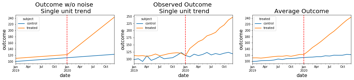
Visual inspection of generated data
The use of plt.subplots and ability to iterate through the yielded axes to reduce repeated code is one of the pretty things about Matplotlib.
## set up a 1 by 3 plotting matrix and set its window's width and height
fig,axes = plt.subplots(1,3)
fig.set_figheight(3)
fig.set_figwidth(20)

## plot the plots
df.loc[[0,40],'noNoise'].unstack(level=0).rename(columns = {0:'control',40:'treated'}).plot(ax=axes[0],linewidth=2)
df.loc[[0,40],'outcome'].unstack(level=0).rename(columns = {0:'control',40:'treated'}).plot(ax=axes[1],linewidth=2)
df.groupby(['treated','date']).outcome.mean().unstack(0).rename(columns={0:'control',1:'treated'}).plot(ax=axes[2],linewidth=2)

# make plot adjustments by iterating through the axes (ie axes.flatten() flattens the array into a vector)
titles = ['Outcome w/o noise \n Single unit trend','Observed Outcome \n Single unit trend','Average Outcome']
for ax,title in zip(axes.flatten(),titles):
    ax.axvline('1/1/2020', color='red', linestyle='--')
    ax.set_title(title,fontsize = 20)
    ax.set_ylabel('outcome',fontsize=16)
    ax.set_xlabel('date',fontsize=16)
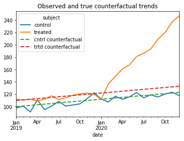
True Average Treatment Effect
Note that we know the true Average Treatment Effect on the treated (ATE) because we know what the observed and true counterfactuals trends are from our setup. The ATE is the average of the difference between the post-treatment-period observations and the post-treatment period counterfactuals for the treated subjects.
The true Average Treatment effect is the average of the monthly differences between the solid orange line and the dashed red line in the below graph.
ax = df.loc[[0,40],'outcome'].unstack(level=0).rename(columns = {0:'control',40:'treated'}).plot(linewidth=2)
df.loc[[0,40],'trueCounterfactual'].unstack(level=0).rename(columns = {0:'cntrl counterfactual',40:'trtd counterfactual'}).plot(linewidth=2,ax=ax,linestyle='--', title= 'Observed and true counterfactual trends')

## compute true average effect
df.loc[:,'post:treated'] = ((df.post==1) & (df.treated==1)) # identify the treated subjects after the treatment

trueDiffs = (df.loc[df['post:treated']].outcome - df.loc[df['post:treated']].trueCounterfactual) #difference outcome and counterfactual trends
trueATE = trueDiffs.mean() ## average the difference between the outcome and counterfactuals

print("The true effect is: %.2f" %trueATE)
The true effect is: 54.74
Fit Difference-in-Difference to the data
statsmodels competes well against R’s OLS and formula capabilities. In another notebook, I outline a few other helpful functions that can mimic some of the STATA regression estimation capabilities (ie estimating multiple regressions). However, it is the concert of Python’s capability to work with strings and statsmodels’ formula capabilities that steal the day. It makes the editing of your formulas very straightforward without having to type out every single variable.
## convenience function for running regressions
def runRegression(y,x,data, cov_type='HC0'):
    form = '{0} ~ {1}'.format(y,x)
    mod = smf.ols(formula=form, data=data)
    res = mod.fit(cov_type=cov_type)
    return(res)

## convenient functions for adding dummies
def add2model(X,addendum):
    return("+".join([X,"+".join(addendum[2:])]))

def colsContaining(s,df):
    fullSet = df.columns[df.columns.str.contains(s)]
    return(fullSet[df.loc[:,df.columns.str.contains(s)].sum().abs()>0])
Regression Setup
Since in the data I generated, I included time trends but not subject-specific effects, I only have to include time fixed effects. The code to generate subject FEs is commented out.
## add time fixed effects to the data
dateDums = pd.get_dummies(df.reset_index(level=1).date.apply(lambda x: x.strftime('%B_%Y')))
dateDums.index = df.index #transfer index for consistency

## make subject FEs
#subjectDums = pd.get_dummies(df.reset_index(level=0).subject)

## statsmodels(patsy) doesn't do well with vars that start numbers so we have to
## make sure that the columns dont start with a number:
#subjectDums.columns = ['subj'+str(s) for s in subjectDums.columns]

#subjectDums.index = df.index

df = pd.concat([df,dateDums],axis=1)
## make model
x='post*treated'
x = add2model(x,colsContaining('2019|2020',df))
print("Here's the formula we will be estimating: \n", x)
Here's the formula we will be estimating:
 post*treated+August_2019+August_2020+December_2019+December_2020+February_2019+February_2020+January_2019+January_2020+July_2019+July_2020+June_2019+June_2020+March_2019+March_2020+May_2019+May_2020+November_2019+November_2020+October_2019+October_2020+September_2019+September_2020
fitted = runRegression('outcome',x,df)
print("The true treatment effect (%.2f) is within the bounds of the estimated ATE of %.2f" %(trueATE,fitted.params['post:treated']))
fitted.summary()
The true treatment effect (54.74) is within the bounds of the estimated ATE of 55.01
| Dep. Variable: | outcome | R-squared: | 0.867 |
|---|---|---|---|
| Model: | OLS | Adj. R-squared: | 0.864 |
| Method: | Least Squares | F-statistic: | 424.5 |
| Date: | Mon, 01 Jul 2019 | Prob (F-statistic): | 0.00 |
| Time: | 13:20:26 | Log-Likelihood: | -4808.7 |
| No. Observations: | 1200 | AIC: | 9669. |
| Df Residuals: | 1174 | BIC: | 9802. |
| Df Model: | 25 | ||
| Covariance Type: | HC0 |
| coef | std err | z | P>|z| | [0.025 | 0.975] | |
|---|---|---|---|---|---|---|
| Intercept | 102.1948 | 0.769 | 132.837 | 0.000 | 100.687 | 103.703 |
| post | -0.0767 | 2.189 | -0.035 | 0.972 | -4.367 | 4.214 |
| treated | 9.9423 | 0.413 | 24.091 | 0.000 | 9.133 | 10.751 |
| post:treated | 55.0051 | 1.537 | 35.797 | 0.000 | 51.993 | 58.017 |
| August_2019 | 3.9463 | 1.041 | 3.792 | 0.000 | 1.906 | 5.986 |
| August_2020 | 23.9917 | 2.227 | 10.771 | 0.000 | 19.626 | 28.358 |
| December_2019 | 9.6573 | 0.964 | 10.021 | 0.000 | 7.768 | 11.546 |
| Omnibus: | 6.241 | Durbin-Watson: | 0.702 |
|---|---|---|---|
| Prob(Omnibus): | 0.044 | Jarque-Bera (JB): | 7.969 |
| Skew: | -0.010 | Prob(JB): | 0.0186 |
| Kurtosis: | 3.399 | Cond. No. | 24.7 |
Warnings:
[1] Standard Errors are heteroscedasticity robust (HC0)
Plot Fitted Lines and fitted counterfactuals
To plot fitted lines, we simply take the dot product between the estimated coefficients and data. You can access the fitted parameters as a pd.Series by simply calling the .params attribute of the object that’s returned from the regression.
The caveat is, when we use formulas from Statsmodels, there are variables created (ie ‘Intercept’ or ‘post:treatment’) that are not in the original DataFrame so if we wish to take the dot product between the estimated coefficients and the data, we must first create the variables generated via formulas in the actual data. In this case, I already created the ‘post:treatment’ column in the above cells but I am still missing the Intercept column so I go ahead and create it here.
print("Accessing the first 10 fitted parameters:")
fitted.params.head(n=10)
Accessing the first 10 fitted parameters:
Intercept        102.194789
post              -0.076707
treated            9.942310
post:treated      55.005147
August_2019        3.946300
August_2020       23.991745
December_2019      9.657265
December_2020     47.702490
February_2019     -1.382826
February_2020    -11.681835
dtype: float64
df.loc[:,'Intercept'] = 1
One convenient way to map the indexes from the fitted parameter pd.Series is to simply call the Series’ indexes and use them to select the correct columns in our data frame (ie df.loc[:,fitted.params.index])
print("The fitted values are thus:")
np.dot(df.loc[:,fitted.params.index],fitted.params) # take the dot product
The fitted values are thus:
array([100.43306767, 100.81196253, 101.29202643, ..., 148.27925361,
       155.52465559, 159.76288131])
## save the fitted values
df.loc[:,'post:treated'] = df.post*df.treated
df.loc[:,'fitted'] = np.dot(df.loc[:,fitted.params.index],fitted.params).astype('float')

## get fitted counterfactual by...
df.loc[:,'post:treated'] = 0  #set the dummy that triggers effect to 0
df.loc[:,'fitted_counterfactual'] = np.dot(df.loc[:,fitted.params.index],fitted.params).astype('float') #re-take the dot product
## plot the fitted lines
ax = df.groupby(['date','treated']).fitted.mean().unstack().rename(columns = {0:'fitted_cntrl',1:'fitted_trtd'}).plot(figsize = (13,6), linewidth=2, linestyle='-.')

## plot the fitted counterfactual
df.groupby(['date','treated']).fitted_counterfactual.mean().unstack().rename(columns = {0:'counter_cntrl',1:'counter_trtd'}).plot(ax=ax, linewidth=2, linestyle='--')

## plot the observed outcomes
df.groupby(['date','treated']).outcome.mean().unstack().rename(columns = {0:'obsrvd_cntrl',1:'obsrvd_trtd'}).plot(ax=ax, linewidth=2)

## decorate
ax.axvline(x='1/1/2020',color='r',linestyle=":")
ax.set_title("Fitted vs observed",fontsize = 20)
ax.set_ylabel("outcome",fontsize = 18)

## I multiply by 2 to compensate for the fact that before the post-treatment period, the difference
## between fitted and counterfactual is by construction 0 so the ATE will be exactly half
## if I average the difference over the entire period
print("Estimated ATE is: %.2f" %((df.loc[df.treated==1,'fitted']-df.loc[df.treated==1,'fitted_counterfactual']).mean()*2))
Estimated ATE is: 55.01
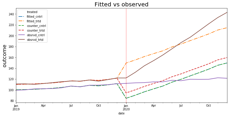
Discussion
Fitted trends vs observed trends
Note that in the above graph, the fitted lines and counterfactual do not align with the observed outcomes after the treatment period. Why? Well, the estimated coefficent of 55 for ATE in the actual model functions like a shifter so all estimated time fixed effects after December 2019 must compensate for that shift so that at least on average the trends match. As expected, we can see that the fitted and observed trends cross at about the half-way point in 2020…or, as you have guessed, the average. Nevertheless, if we use the fitted lines to estimate the ATE, we can a pretty close figure.
Could we recreate a better fit? Sure, if instead of simply using post:treatment as our way of capturing the ATE we segmented the post:treatment variable into individual months (ie post:treatment:January_2020, post:treatment:February_2020…) then the fitted lines would much more closely align with the observed trends.
Interpretation of our graph
So what’s the takeaway if the fitted counterfactual doesn’t resemble the observed trends? Well, in this picture, we can take comfort in the fact that the rank of the fitted lines (ie fitted counterfactual is below fitted and observed trends..etc) is in order with expectations. If, for example, the counterfactual were estimated to be above both the fitted and observed trends for the treated subjects then we would have a clear red flag that the ATE we are estimating is completely bogus.