Do minority households reside in worse quality units?
Introduction
In exploring renters in 2015 American Housing Survey (AHS), I stumbled on a relationship between race and housing adequacy that I thought is worth a bit of exploration for your mid-day coffee reading. Chiefly, minorities, especially black households, tend to be overrepresented in inadequate housing. For example, in the Milwaukee metro, 30% of households are black but 37% of Moderately and Severely Inadequate housing is occupied by black households. The finding that minority households tend occupy housing units of worse physical quality is not new. I am guessing that if you are reading this, you would have guessed as much. Quick Googling instantly leads to a 1993 HUD report and Mundra and Sharma 2009 studies that document this overrepresentation of minority households in inadequate housing though documentation of this phenomenon goes back to at least the 1970s.
So what is housing adequacy? From the HUD report that elaborates on the housing adequacy question, “The U.S. Department of Housing and Urban Development developed this measure to assess the extent to which the housing stock met the standard of ‘a decent home and a suitable living environment,’ established by the Housing Act of 1949. The AHS definition of physical adequacy is complex; any 1 of 14 different situations can result in the classification of a unit as having severe physical problems…The two most frequently observed problems are having to share the bathroom (55 percent) and heating failure (29 percent). More than one-half of the severely inadequate units reported one household sharing its bathroom with another household.” (Eggers and Moumen 2013).
In this post, I first visually illustrate the relationship between housing inadequacy and race for Milwaukee (I really ought to diversify a bit) and then show how the relationship is more perverse in Philly, Detroit, and Washington. For this analysis, I only look at rented units. Furthermore, I drop observations that fall under the “Boat, RV, van, etc” category. Additionally, to simplify the discussion, any household that had an Alaskan or Indian label in their race was labeled as indigenous. Mixed households (ie white-black or white-asian) were dropped. Finally, though the hispanic population is important for analysis in many metro areas (ie Los Angeles), the hispanic shares are more often than not too low so I do not include them in this analysis. The notebook used to generate the graphs is available on GitHub
Race and unit inadequacy
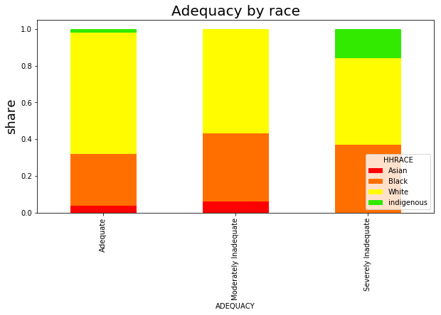
64% of renters in Milwaukee are white while 29% are black and 4% asian. If we were to assume that unit inadequacy is equally likely among all races then I would expect the same proportions to occupy both adequate and inadequate units. For example, I would expect 64% of inadequate units to be occupied by whites and 29% to be occupied by blacks. When we examine unit adequacy by race, we see largely consistent patterns whereby 65% of adequate units are occupied by whites, 28% by blacks, and 4% by asians. However, the uniformity ends there. When we look at the moderately and severely inadequate bars, the share of whites decreases substantially. Namely, among the moderately inadequate units, 37% are occupied by blacks, 6% occupied by asians while 55% are occupied by whites. It becomes slightly more distorted in the Severely Inadequate units where only 48% are occupied by whites, 37% by blacks, and 16% by a household with indigenous roots. Is this surprising?
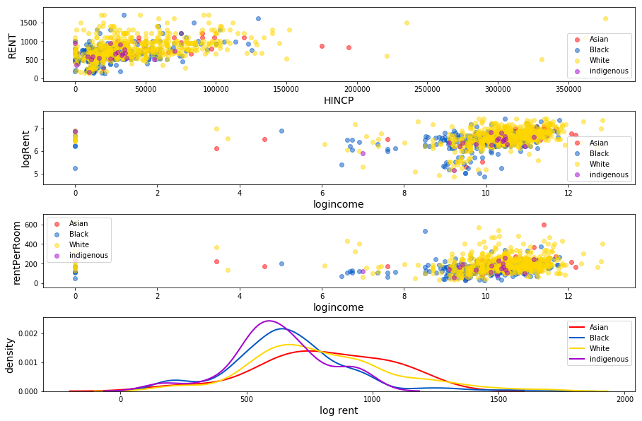
One would expect lower levels of adequacy among cheaper units and since there is a high correlation between minorities and lower socio-economic attainment, it is possible that in the above plot, we simply confounded race with socio-economic status. As we see above, black and indigenous households are more represented on the lower end of the rent spectrum. Interestingly, though blacks do tend to have both lower rents and lower incomes, indigenous households are mixed in the middle of white household renters in terms of income and rent. Another way to do a quick check is to plot rents against adequacy and race.
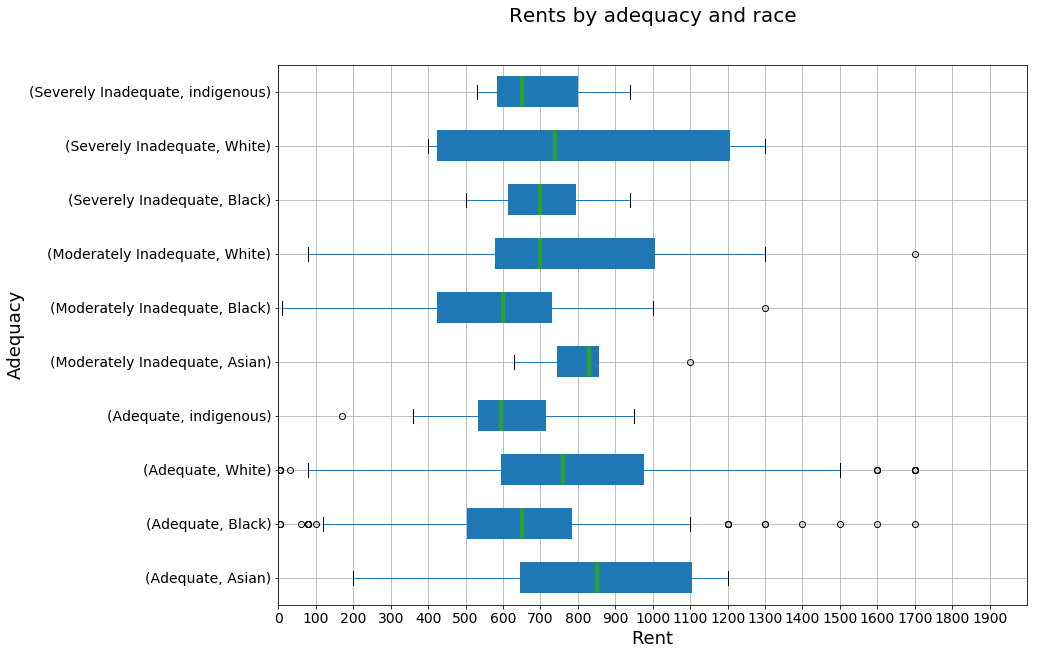
In the box plots, as expected, we see that rents are generally higher among whites than blacks and indigenous households (though highest for Asians) which may explain why inadequacy rates are higher for blacks and indigenous households. Namely, lower rents may signal lower quality residence and, likely, that landlords are less able or willing to do maintenance. However, consider that the median rent for whites residing in adequate housing is about $750 while the median rent for blacks and whites residing in moderately and severely inadequate housing is $700. What’s perhaps even more interesting is that median rent for blacks residing in moderately inadequate housing is $600, over $100 less than for black households residing in severely inadequate housing. A similar pattern emerges for indigenous households. Of course, in this graph I am not even comparing units of same size so the above is only interesting under the assumption that, on average, unit size and type is the same across these categories. Nevertheless, the above is suggestive that perhaps more is at play than households of lower socio-economic status renting lower quality units.
Other Metro Areas
How do racial disparities in unit inadequacy differ by MSA? To get an image of how unit inadequacy behaves, I took the difference between the share of each race in each adequacy category (Adequate, Moderately and Severely Inadequate) and the share of race in each CBSA. For example, if 20% of households in a CBSA are black but 30% of households occupying severely inadequate housing are black, then the bar will show 10% for the CBSA in the severely inadequate bar graphs. In essence, if the bar is positive for a race then that race is overrepresented in that housing inadequacy and if it is negative then it is underrepresented.
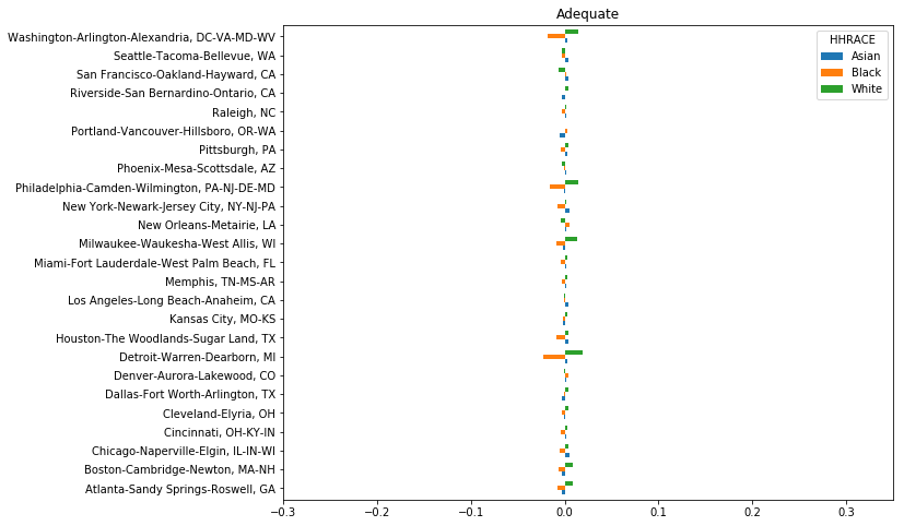
In regard to adequate housing, we can easily see that household races are pretty equally represented across most CBSAs. However, there are noticeable deviations in Philly, Detroit, and Washington where white households are more over-represented in adequate housing than the other cities. We see why below:
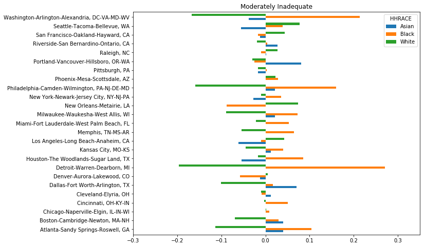
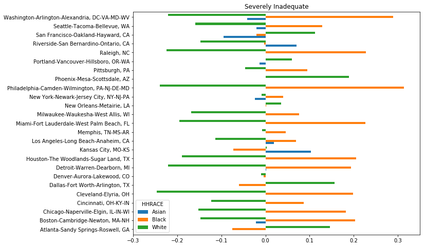
The images for inadequate housing are very different from adequate housing (tad euphamistic). In 4 CBSAs (Washington, Philly, Detroit, and Atlanta), the share of blacks in Moderately Inadequate housing is over 10 percentage points higher than their share in the CBSA. In 7 CBSAs (Houston, Cleveland, Boston, and the now typical culprits), the share of blacks is 20+ percentage points higher than their share in the city. Both Washington and Philly make Milwaukee look rather fair despite Milwaukee having a 10 percentage point discrepancy in severely inadequate housing. Alternatively, we observe that in most CBSAs, whites are underrepresented in inadequate housing. The data for Asian households are mixed because often they are not even registered as residents in inadequate housing and when they are, deviations from their CBSA share are mixed across CBSAs.
Discussion
Now, I am not suggesting that landlords renting to minorities are deliberately taking a hammer to apartment walls in the middle of frigid winters out of spite or discrimination. There are countless alternative explanations that could lead to our observations. For example, since Milwaukee is a rather segregated city, it could be that some landlords sort into serving minority households but since their units also tend to be cheaper and of lower value, landlords who sort into such neighborhoods may have less incentive and capacity to do proper maintenance on their units. Moreover, according to the Eggers and Moumen report, most units that are sampled as severely inadequate in one AHS survey show improved conditions in subsequent surveys which suggests that, at the unit level, unit inadequacy may not be a persistent problem (2013).