Rent Distribution Changes in LA County
Teaser
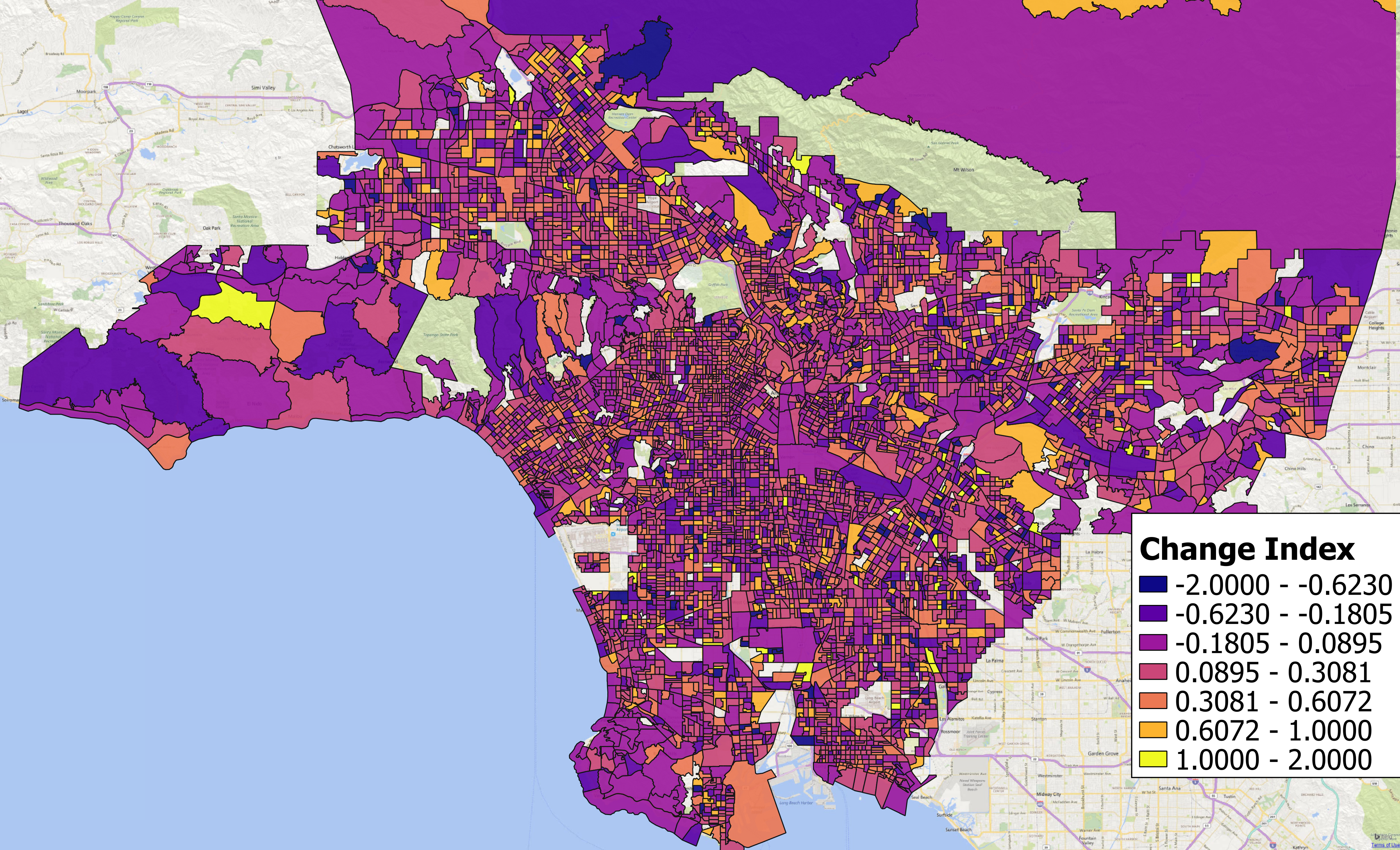
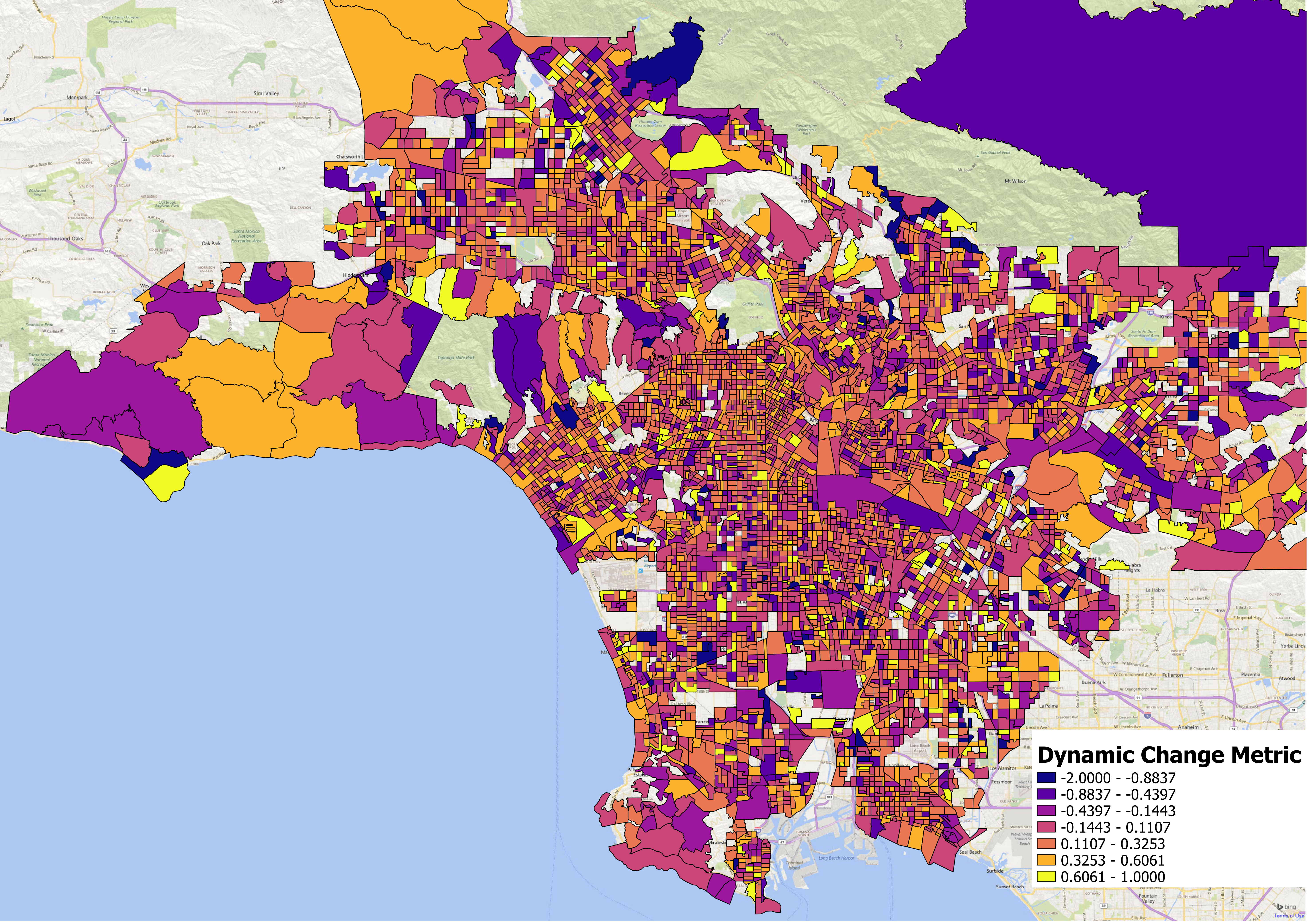
In the map of LA County block groups below, areas that experienced large shifts away from lower-cost ($600-999) rental housing toward higher-cost ($1,500+) housing are orange and yellow. Block groups in which rental housing shifted in the other direction are dark blue and purple. For a more general assessment of areas in which the rental distribution shifted up or down, check out the 2nd map.
Introduction
Researchers and practictioners have a habit of looking at changes in median gross rents to detect areas that are becoming more expensive. That is a fair yet limited perspective if the researcher is interested in the loss of low-cost rental housing. The fact that rents in a high-cost neighborhood went up from a median $2,000 to a median of $3,000 a month is not particularly relevant for low-income households and low-cost housing. For a more relevant measure, I develop a metric that explicitly reflects losses of low-cost housing and shifts toward high-cost housing at the neighborhood level. I illustrate my metric by comparing rent distributions across two 5-year ACS survey periods 2009-2013 and 2013-2017 in Los Angeles County.
I want a metric that shows whether the rent distribution has shifted upward or downward across the years without recourse to micro level data. Moreover, using this metric, I wish to compare the size and direction of the shift between geographies so that geographies with a high metric experienced a large rightward shift in the rent distribution (thus became more expensive) while geographies with a low metric experienced a leftward shift in the rent distribution (thus became less expensive).
In this post, I propose two metrics for shifts in rental housing. For the first, a high value suggests that a large portion of low-cost housing that was in the area has disappeared. A very low metric means that high-cost housing disappeared and was replaced by low cost housing. Areas with a metric that is near 0 either experienced little change in low-cost housing or are high cost areas (ie all rents are $1,500+). Why is this important? If you are looking for areas that have experienced a large loss of low-cost rental housing then you can find them by searching for block groups with a high metric values. For a detailed look at my metrics or to construct your own maps, you can download the shapefile for Los Angeles County and explore your area of interest.
The second metric reflects changes in the rental distribution more generally but does not necessarily reflect loss of low-cost rental housing. There is a clear trade off between the two so it depends on whether the researcher is seeking areas experiencing losses in low-cost housing or upward/downward shifts in the rental distribution more generally. The latter may be more appropriate when searching for areas of high demand or development. As always, access to the notebook used to create and examine the metrics is available on GitHub.
Data
For this project, I downloaded the 2009-2013, 2011-2015, and 2013-2017 5-year sample ACS data on tenure, gross rent, and median rent from socialexplorer. The intention was to download rents by bedroom but the ACS cutoffs are a joke when it comes to CA. The observations are censored above $1,000 which, for CA, renders the data useless. For mapping my metrics, I use block group TIGER shapefiles from the Census.
Metric Construction
Consider the rent distribution in a Census block group as supplied by the ACS survey below:
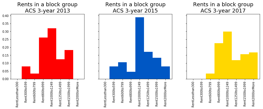
As we can see in the above histograms for ACS Surveys 2009-2013, 2011-2015, and 2013-2015, the rent distribution in this particular block group has shifted to the right so that the share of higher-cost units is greater than before. In fact, for this particular block group, we see that in the 2009-2013, about 7% of units were renting for $300-599 and no units were rented for over $2,000. By the 2013-2017 period, there were no units in the $300-599 range and 15% of units in that area cost over $2,000 a month. Pretty big change, eh?
How do we generalize this analysis for an entire area though? We can’t possibly plot 3 histograms for each Block Group in Los Angeles County (there are over 6,000 of them) and then visually examine whether the distribution has shifted up or down and how much. We need another solution. The straightforward way is to look at the median rent for the area but I think we can do better.
To construct a metric for distributional change without micro-level data, for each Census Block Group, I 1. compute the share of units in each rent segment (ie 20% rent for $300-599) 2. compute the change for each segment between the 2017 and 2013 ACS surveys, and 3. compare the change in the top two segments ($1500+) against the change in the bottom two segments ($600-1,000). For a clearer/cleaner view on the metric, you can see the equations in my notebook. The metric takes on values between -2 and 2. If there is no change in the rent distribution then the metric is 0. If all low-cost units became high cost then the metric is 2 while if all high cost units became low cost units then the metric takes on the value of -2.
Verify metric
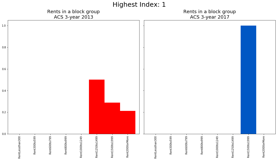
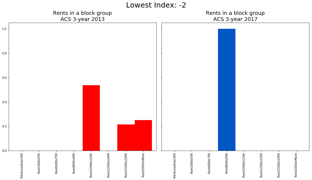
To verify the metric reflects distributional changes, I plot the rent distribution for a block group with a change metric of 2 and a block group with a change metric of -2.
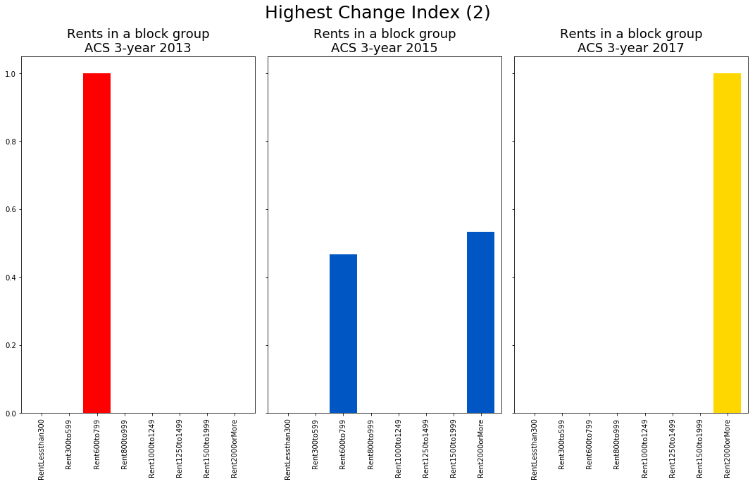
In the barplots above, we see that all units that were renting for $600-999 in the 2009-2013 survey period are gone by the 2013-2017 period. In 2013-2017, all units rent for over $2,000. This is precisely what we wish the high change metric to reflect.
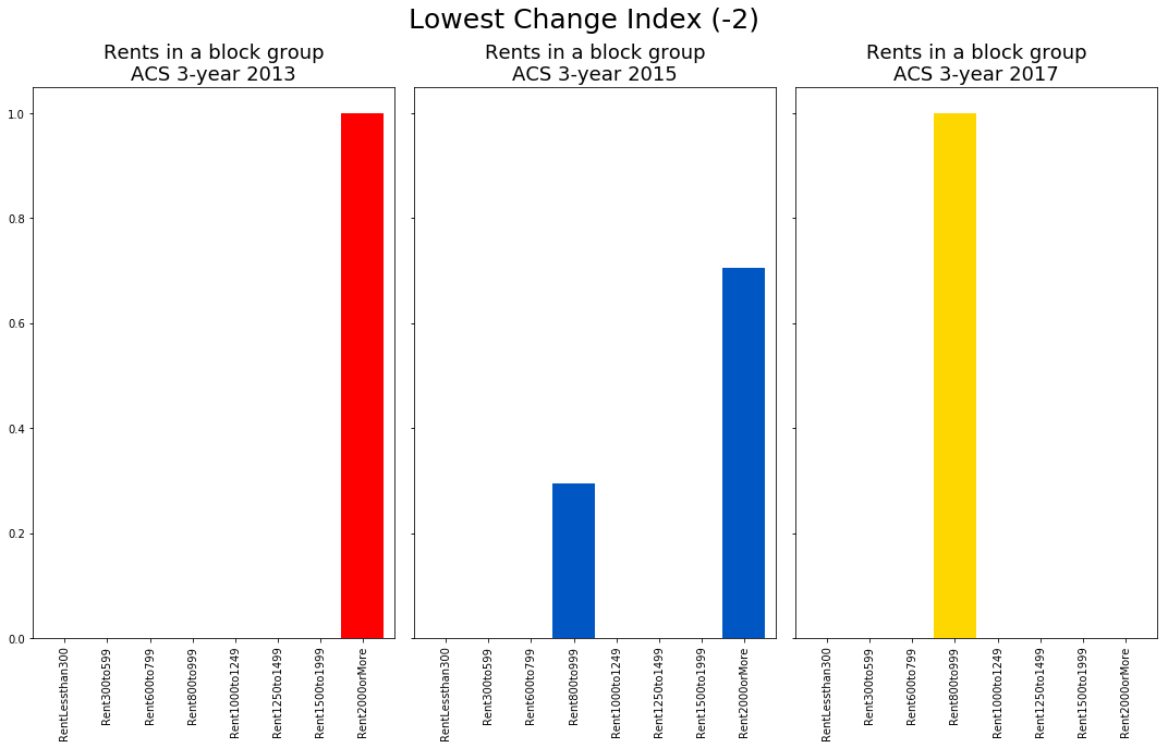
For the block group with a change metric of -2, we see that all units that were over $2,000 in the 2009-2013 survey period are gone by the latter survey. There are only units in the $800-999 range. Honestly, I never thought such things happen but voila, areas do in fact get cheaper! «insert head explore emoji»
Median Rent Comparison
How does my change metric compare against the more traditional change in median rents? First, for each block group I compute the change in median rents between the 2009-2013 and 2013-2017 surveys. To compare the this to my metric, I plot a scatter plot of the block group ranks as determined by changed in median rents and my distributional change metric.
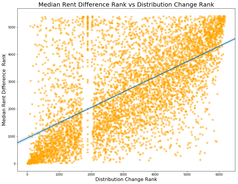
We see that the two ranks correspond somewhat but there is considerable spread. There are many block groups that experienced a high change in median rents but seem to have experienced a leftward shift in the rent distribution! We see the converse too: some areas with high rightward shifts (ie become more expensive) in the rent distribution experience small changes in median rents. Do the two seemingly contradictory movements pose a challenge? Not necessarily since there are many distributional shifts one can conceive that can reconcile the diverging movements in the two metrics.
We do see a peculiarity in the graph. There are a large number of block groups that are tied in rank on the x-axis (my change metric) which can only mean that these groups experienced 0 change in the rental distribution. However, many of these same block groups experienced large rightward shifts according to the median rent changes. How can we reconcile the two? Suppose all units in a block group have rents over $1,500 in both 2009-2013 and 2013-2017 periods. If rents went up then the median rent would reflect that (ie go from $2,200 to $2,500) but this shift wouldn’t be registered by my metric. Alas, this is an inherent limitation of working with top-coded data. If the Census’ rent segments were better tailored to California prices then my metric would be able to reflect shifts at the top end of the distribution too.
There is another limitation in working with pre-defined definitions of what it means to be a low and high-cost rent segment. If a block group only had units renting over $1,000 in 2009-2013 and by 2013-2017 all units are in the $1500+ range then the my metric will suggest a near-zero shift yet clearly the distribution shifted substantially. Can I rectify this? Should I? The advantage of this metric is that it clearly detects the loss of low-cost rental housing. Removing the pre-defined definitions of what it means to be low and high-cost would undermine the metric’s capacity to detect such losses but would better reflect shifts in the rental distribution more generally.
Dynamic Rent Change Metric
Instead of using static definition of what is a low-and high-cost rent bin, I can make it dynamic. To achieve this, I compute the metric as the shift from rents below the median rent to rents above the median rent. For example, suppose a block group has a median rent of $1,200. This median rent falls into the $1,000-1,250 rent segment. All segments below this (ie $300-999) are now below the median rent segment and all segments $1000+ are above it. Thus, the metric is the the sum of rent share changes for rent segments in the $1,000+ range minus the rent share changes for <$1,000 rent segments . Before, it was always the share change for segments $1,500+ minus share changes in segments $600-999.
Validation
As above, I plot the before and after rent distributions for block groups that experienced the biggest and smallest changes according to the metric. When the index takes on the value of 1, all rental units that rented below the median are suggested to have shifted to be above the median. This is exactly what we see in the High graph below. Conversely, if the metric is -2 then all units that were renting above the median in 2013 disappear so that all units by the latter survey rent below the median. Again, the Low graph reflects precisely that.
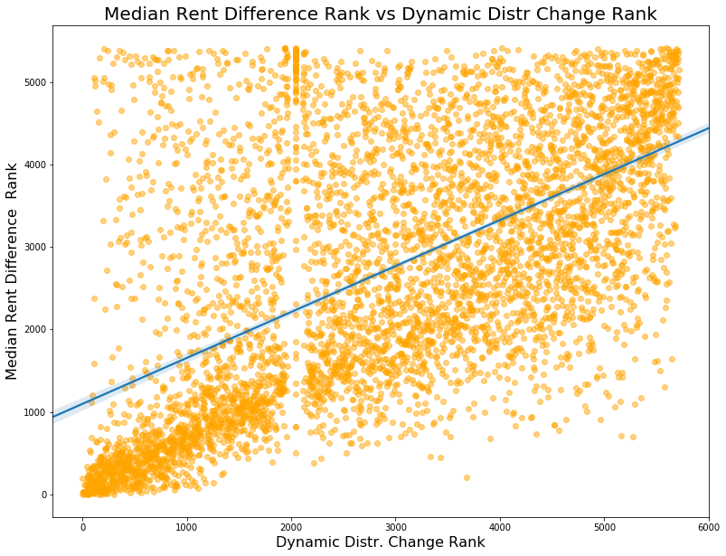
As seen below, the dynamic metric corresponds a little better with with median rent change ranks - at least in the bottom right corner. The correspondence between the two seems best in the lowest ranked 3000 block groups but the correspondance falls apart for block groups ranked higher than that. The issue of block groups with all rents over $2,000 in both periods continues to prevail but, as mentioned earlier, there is no way around that given the data limitations.
Discussion
Both static and dynamic metrics have merit in examining the rental market landscape. Although more subjective, the static metric can be tailored to target populations and rents of interest. For example, this metric will show block groups in which there were low-cost units that were lost whereas changes in the median gross rent will not show that. Moreover, that my metric is somewhat indifferent to the fact that rents in a high cost areas have increased from $2,500 to $3,000 may be a benefit because it filters out high cost areas and only shows areas that experienced drastic changes in supply for low-cost rental housing.
The dynamic metric for rental distribution changes is not as good at picking up the loss of low-cost rental housing because the base shifts for each neighborhood but it is much better at detecting rightward shifts in the rental distribution. If the researcher is interested in areas that are in high or low demand, the dynamic metric is a better tool.
P.S: apologies for the rather verbose and redundant writing - past few days have been rougher than usual.