Rentribution Inc(...ome)
Introduction
Do you recall the incident in which fear of an economist’s math notation delayed a flight? Well, this story is not about that. It just also occurred on a plane. On a recent flight from a conference, I happened to be situated next to an ex-corporate NY attorney who rather willingly became a landlord. We mostly discussed matters of love but, after he showed me the cash-flows from over 100 properties scattered about countless states and cities, as much as matters of heart are fascinating, I took the opportunity to inquire about the way he priced his units.
What was fascinating about his portfolio is not only its size but as also its heterogenous nature. Some were rented to upper middle class households, others to somewhat less fortunate ones. The returns on investment also varied considerably - from the general 6-7% to 40% (I kid not, he showed me the figures). Perhaps also to the point, he bothered to mention that he micro-managed his holdings so rents were determined predominatly by him. So my question was simple, why did he price the units the way he did? I expected some layered response incorporating elements of the state of the economy, unit and neighborhood quality, management costs, turnover minimization, tenant quality, and much more. By comparison, the response was remarkably simple: twas but a mere matter of tenant (or rather neighborhood) income: the more they earned, the more he could charge. Fair enough but how does the anecdote hold up in data?
In brief, rent distributions can indeed largely be explained by variation in the renter income distributions. If we assume that both rents and incomes follow log-normal distributions (neither does by a fair margin) then both distributions can be entirely characterized by two parameters: log means and standard deviation of log rents which I’ll call spread. A simple OLS on log mean rents and respective standard deviations across CBSAs available in the 2015 and 2017 AHS suggests that 77% (54%) of variation in log mean rents (spread) is explained by the log mean and spread of the renter income distributions. These fit statistics reliably suggest that renters’ incomes do explain most of the rent distribution story - as implied by my co-traveler. However, it is clearly not the whole story. Inevitably, items such as variation in the underlying land values, market segmentation, access to the ownership market, and many other factors may play into how rents are distributed. Below, I describe the set up a bit more and discuss how access to the ownership market can factor into the income distribution of renters.
Rents
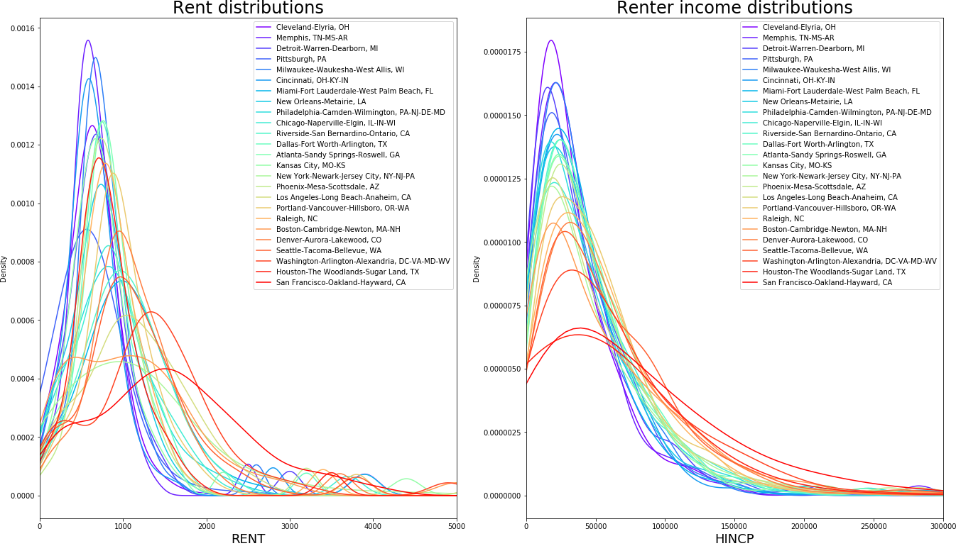
There are two vital features to be observed in the plots above. First, as Geoff Boeing similarly demonstrates in his paper and summarizing blog using Craigslist data, rents in most metropolitan areas have lower means and spreads than their richer counterparts. The fact that Cleveland or Milwaukee have, on average, cheaper rents than New York or San Francisco is scarcely worth mentioning but the difference in the spreads is interesting. The rent curves we see clearly show that the distance between the lowest and highest rents in the aforementioned cities is less than the distance between the lower and higher rents in San Francisco. This further implies, as suggested in this entry, that the difference in rents between high-quality and low-quality rental units is much smaller in areas with lower mean rents. If we plot curves for renter incomes, we observe a largely similar pattern whereby metros with higher average renter incomes also tend to have higher spreads in their rent distributions. This would suggest, as implied by my flight conversationalist, that the income distribution is likely the biggest factor behind rent spreads. As seen in the above tables, that is largely confirmed. Yet, it’s clearly not the whole story. For one, note that the rent KDE peak (or mode) differences between the CBSAs seem to have more variation than income peaks.
Competition between ownership and rent markets
The income distribution of renters is not exogenous in the metros because households shop for housing in two markets: the rental and ownership markets. In virtually all urban economic studies, we treat the two as separable or interchangeable even though they clearly influence each other. If the two were separable or interchangeable, rent distributions should look nearly identical to the renter income distributions as suggested by sorting - even if we factor in things like taste.
In a somewhat simplified manner, given the tendency of higher income households to occupy higher quality neighborhoods, neighborhood rents will be in part determined by the average income of the neighborhood. Now suppose that it is always preferrable to own a home so given a chance, renting households will exit the rental market by buying a house. For numerous reasons, owning typically requires more wealth and, potentially, income so higher income households are more likely to become home owners. Suppose that the market is in equilibrium and consider the price of a high-quality neighborhood. Now suppose that a set of high-income households exit the rental market because they managed to get mortgages for their dream house and no households replace them. This means that the renter income distribution experiences a left-ward shift and a decrease in its spread which, in turn, decreases the amount landlords can charge in this high quality neighborhood. As a result, the rent distribution experiences a left-ward shift and decrease in spread. What happens at the bottom of the renter income distribution? Nothing changed in this segment so landlords can continue to charge similar rents (provided that neighorhood prices can still change due to equilibrium prices). Note this also implies that the price difference between high and low quality units decreases. What does this mean on a grander scale? Essentially, markets such as Milwaukee and Cincinnati, in which home ownership is more accessible, both the renter income and rent distributions will have less spread than markets such as NY or SF in which households across a larger spectrum of income rent. What does this look in practice? Consider the image below:
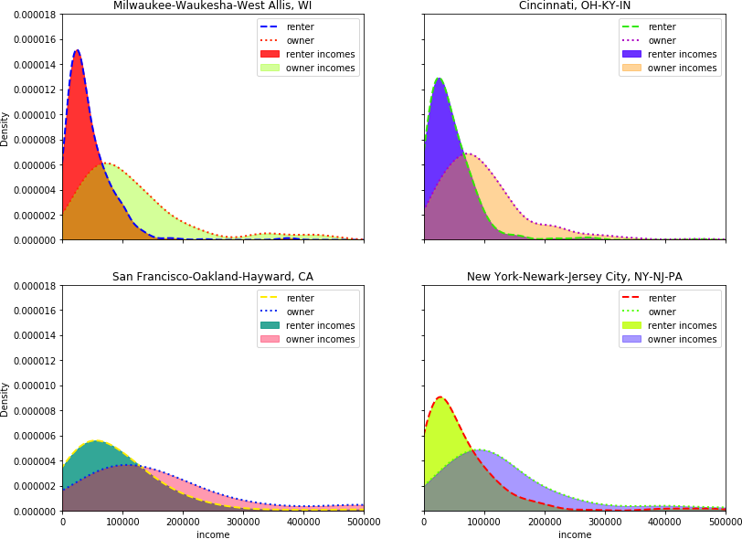
In the figure above, we see the income distributions of renters and owners in four metros. Two of the metros, Cincinnati and Milwaukee, have relatively small spreads and we see that the overlap between the two income distributions is not very large because higher income households have sorted into the ownership market. On the other hand, in San Francisco and New York, the separation between the two income groups is not as large because a wider spectrum of households have to rent. Thus, as a proxy for home-ownership accessibility, we can use the amount of overlap or separation between the two distributions.
For a numerical comparison, I integrate each of the KDE curves and compare the overlapping areas of owner and renter income distributions. I estimate gaussian kernels for renter and owner incomes in each CBSA and then numerically integrate both curves from the 5th to 95th renter income percentiles. For the KDes, I only use households who have resided in their residence for less than 10 years and are between the ages of 21-64 though in practical terms, these restrictions have no bearing on the estimates below. To get area comparisons, I simply divide the owner area by the renter area and call this the overlap. I plug the overlap measure into the regressions on the log average rent and spread of log rents statistics. A larger distributional overlap suggests the ownership market is more inaccessible so households across a wider income spectrum rent and rent spreads are higher. Since more expensive ownership markets also tend to coincide with higher income areas, I also expect the sign on the overlap to be positive and significant on the log average of rents. I toss in a year fixed-effect because I’m using 2015 and 2017 data and housing supply elasticity measures from Saiz 2010 because metropolitan incomes tend to be endogenous with the regulatory environment.
Results
| dependent var: | log mean rent | log mean rent | log rent spread | log rent spread |
|---|---|---|---|---|
| log mean income | 0.7235 (0.000) | 0.6819 (0.000) | 0.0771 (0.100) | 0.0579 (0.177) |
| log income spread | 0.1799 (0.526) | 0.3206 (0.199) | 0.6043 (0.000) | 0.6693 (0.000) |
| distr, overlap | 0.4917 (0.000) | 0.2271 (0.002) | ||
| supply elasticity | -0.1495 (0.000) | -0.1092 (0.000) | -0.0432 (0.005) | -0.0246 (0.097) |
| R^2 adj | 0.77 | 0.83 | 0.54 | 0.62 |
| nObs | 50 | 50 | 50 | 50 |
As we can see in above table, all coefficients bear out expected signs. In the second and fourth columns, we see that, indeed, a proxy for home-ownership accessibility does increase our ability to explain variation in the rent distribution. Notably, the adjusted R^2 increases from .77 to .83 for log mean rents and from .55 to .62 for the spread in log rents.
Sniff Test
Do the above results hold any water or am I just fooling myself into believing my narrative? Let’s consider two other measures of home-ownership accessibility: 1) home price to renter income (pti) and 2) more simply the share of owners in between the 5th and 95th renter income percentiles. In the first two columns, we see that pti has nearly the same explanatory power as using the overlap in distributions though pti does a tad better for log mean rents(funnily(?), the correlation between overlap and pti is 96%). In the 3rd and 4th columns, using the share of the owner area yields virtually the same results as using the overlap. These results already imply that we can do equally well or better with simpler ownership-accessibility metrics so there’s no need to integrate KDEs. So was the integration and KDE estimation all in vain? Let’s call it, experimentation.
| dependent var: | log mean rent | log rent spread | log mean rent | log rent spread |
|---|---|---|---|---|
| log mean income | 0.5342 (0.000) | 0.0150 (0.753) | 0.7232 (0.000) | 0.0770 (0.071) |
| log income spread | 0.0205 (0.923) | 0.5520 (0.000) | 0.3512 (0.144) | 0.6770 (0.000) |
| pti | 0.1054 (0.000) | 0.0346 (0.005) | ||
| ownerArea | 0.6912 (0.000) | 0.2932 (0.002) | ||
| supply elasticity | -0.0625 (0.013) | -0.0147 (0.382) | -0.0980 (0.000) | -0.0214 (0.156) |
| R^2 adj | 0.87 | 0.61 | 0.84 | 0.62 |
| nObs | 50 | 50 | 50 | 50 |
But let’s prod it further. I dump in some demographic characteristics of each metro’s renting population, including its average age, share married, and share with a college or more education. Including these 4 demographic characteristics increases my adjusted R^2 to a whopping 91% in explaining the log mean rent and to 70% in case of spread in log rents. Of course, I am only using 50 observations so it is fairly easy to get a high R^2 - repeating this exercise with more metro areas would certainly help mitigate this inflation. However, all of this is trivial when juxtaposed with the fact that the income statistic coefficients are no longer significant in case of log mean rents. We basically come away with the notion that the only income statistic that bears an impact on rent distributions is the spread of log incomes on the spread of log rents. But there’s room for caution since this annulment of results could be due to multicolinearity between education, age, and income but I’ll leave it at this.
On side note, I am implicitly assuming we are comparing a similar set of goods across MSAs. Namely, shouldn’t I use rents per square foot or some other size-adjusted rent metric for the analysis? For the above analysis to hold, we would need the distribution of unit sizes and types to be similar across different metros which is not likely the case. To quell the curiosity, in columns rrent_mu and rrent_spread, I re-ran the regressions with income distribution statistics and overlap as the explanatory variables but for the dependent variable, I used rents with number of bedrooms, bathrooms, and building type regressed out. The coefficients will not match to prior results but in terms of sign and significance, the results on the spread are comparable to the other models. The minor nuance is that by construction residuals have a 0 mean. Although in practical terms the residuals don’t actually have a 0 mean, there is not much variation in them. Income spread still has a significant association with the residual means which that’s probably because the spread statistic captures the presence of outliers and outliers are poorly predicted by the adjustment variables. Overall, considering Geoff’s rents are normalized by square footage and show similar results, I am glad that the results on spreads are at least robust unit to size and type adjustments.
| outcome var | log mean rent | log rent spread | mean residual rent | residual rent spread | delta |
|---|---|---|---|---|---|
| log mean income | 0.0808 (0.643) | -0.0479 (0.696) | 0.0955 (0.698) | 37.2495 (0.819) | -0.1833 (0.371) |
| log rent spread | 0.3102 (0.188) | 0.5297 (0.002) | 3.2082 (0.000) | 1974.0050 (0.001) | 0.6265 (0.026) |
| distr. overlap | 0.2225 (0.032) | 0.1469 (0.043) | 0.5448 (0.191) | 894.3718 (0.002) | 0.0882 (0.456) |
| upply elasticity | -0.0583 (0.007) | -0.0012 (0.933) | -0.0536 (0.527) | -55.7183 (0.320) | -0.0283 (0.246) |
| meanAge | 0.0319 (0.001) | 0.0174 (0.008) | 0.0029 (0.784) | ||
| shareMarried | 1.7825 (0.000) | 0.1640 (0.475) | -0.2785 (0.466) | ||
| shareCollege | 1.3680 (0.001) | 0.4983 (0.070) | 0.7110 (0.118) | ||
| R^2 adj | 0.91 | 0.72 | 0.36 | 0.47 | 0.4 |
| nObs | 50 | 50 | 50 | 50 | 50 |
The one last thing (in the last column ‘delta’), I test the impact of renter income statistics on the rent-to-quality gradients I estimated here. Interestingly, none of the demographic or log mean rents are significantly associated with the gradient suggesting that the spread in rents across quality is largely determined by the spread in log renter incomes. Let’s hope this will not be the underwhelming conclusion of my dissertation.
Discussion
What’s the take away from all this? First, if you read this far, thank you!
There’s a lot that can be done in areas such as Cincinnati. As Boeing and a few other uncirculated manuscripts already mention, moving low-income households to higher quality units is cheaper in areas with low rent spreads. Alternatively, moving higher-income renters into the ownership market can further narrow rents spreads in these cities and thus increase upward mobility among low-income households provided spatial socio-economic segregation does not change.
In a city with in or out movers, landlords renting bear more risk in returns as their consumer base may permanently leave the market to own if economic conditions are appropriate.
Houston has a very odd new home-owner income distribution: it’s almost uniform.
As a side note, in reading this, you may have thought - why is he using occupant income? After all, the landlord determines the rent not off of the occupant’s income but off of the income distribution of the neighborhood. Wouldn’t the log mean income of neighborhood residents be a more appropriate tool for this sort of analysis? Yes. Yes, it would but data limitations preclude it. I would need micro-data on rents and neighborhood income for each tenure type for each observed rent. Alas, short of restricted AHS data, no such data exist.
Thanks
In an earlier post I discussed rent spreads across unit quality in different metros but I thought maybe I’d revisit it briefly because Geoff Boeing informed me of his numerous writings similarly documenting compressed rent spreads across metros. Perhaps more to the point, he produced some very pretty kernel density graphs using Craigs list data but, as he documents, online listings are not that representative of more general rental market. I wanted to recreate his plots using American Housing Survey (AHS) data to see how they compare and also take a look at the causes behind them. But most truthfully: I wanted to make some pretty plots too.